The Moscone Center in San Francisco hosted The Dieline Package Design Conference held by the eponymous website and Inwork, a packaging and prototyping consultancy, on occasion of the latest “HOW Design Live” event.
The Dieline Package Design Awards are an annual worldwide contest dedicated to brand packaging. For the 2013 edition, the competition received over 1,100 entries from 61 countries around the world. The contest is chaired by Debbie Millman, who along with her team at Sterling Brands, also judges the New York International Olive Oil Competition Design Awards.
The Dieline competition had thirteen categories, many of them dedicated to food. Judging criteria were based on the quality of creativity, marketability and innovation. Besides the standard awards, the highest scoring project received a “Best of Show” award, and could present a case study at the conference. Andrew Gibbs, Founder of The Dieline, also handpicked an “Editor’s Choice” award, and this year a new Sustainable Packaging Award was created.
The “Dairy, Spices, Oils, Sauces, & Condiments” category featured three extra virgin olive oils. My Olive Tree, from Greece, took third place, while A Couple Drops (Greece, again) and the Italian Madonna Dell’Olivo Special Edition 2013 pack received a Merit award.
Madonna Dell’Olivo is an award-winning oil farm led by the geologist Antonino Mennella, who particularly dedicates his work at the oil-mill to enhance and value features of the different olive varieties.
Madonna dell’Olivo is located in the Southern Italian region of Campania, near an ancient Sanctuary in the very heart of the beautiful Cilento area which is much appreciated both for its welcoming seaside and for its countryside rich of history and fertile lands. The Sanctuary takes its name by the miraculous sight of the Madonna over an olive tree by some young local shepherds in the 16th century.
From the 200 olive trees around the family’s ancient mansion, which he saved from disrepair, Mennella produces extra virgin olive oils from depitted olives, such as the RaRo – a wonderful and complex 50/50 blend of Ravece and Rotondella local varieties, with its charming aroma of freshly cut grass, tomato skin and aromatic herbs. There is also the monovarietal Itrans, made of Itrana olives, with a delicate floral aroma bringing more elegance to its rich character, and Carpellese, made of this less-known yet excellent local variety.
This year Mennella decided to pack a limited number of 1.5‑liter bottles — a bigger format of the classic Butterfly often adopted for premium Champagne that he also uses in a smaller format for the 250ml bottles — with a special label and an elegant box, to be used as a gift or for special occasion.
In 2013 only about 100 “special packs” have been made, the bottles mainly filled with Carpellese or other Madonna dell’Olivo’s oils on request. Many of them were sent to the U.S., one of the main markets for this small Italian company. For 2014, he plans to do pretty much the same number of the special package made much more for prestige than business.
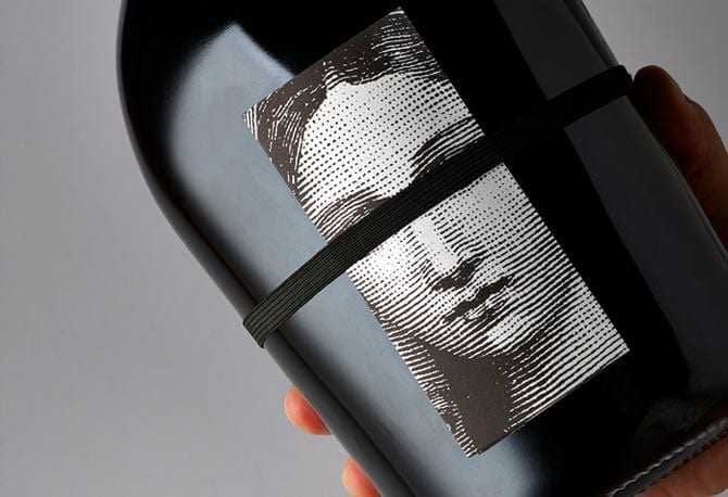
After having redesigned the brand’s logo and labels in the past three years, the multidisciplinary design studio NJU — based in Eboli, Cilento — described this innovative packaging solution: “It leverages — through a distinctive 1.5 litre magnum bottle choice, texture and etched illustrative detail — the heritage, high quality and celebratory spirit associated with champagne and the experience and passion of a craftsman.”
Richard Baird, an English free-lance designer specialized in logos, brand and packaging and editor at The DieLine, also wrote, “There is an almost reductionist approach to the packaging solution in the way that it favors imagery and structural choice as visual metaphors, rather than focusing on direct and conventional cues. Making great use of established perceptions cross pollinated from other industries to achieve a communicative simplicity and a visual quietness that feels sophisticated but not abstract. A solution that compliments a proposition likely to appeal to customers with an already established brand relationship looking for something distinctive for a special occasion.”

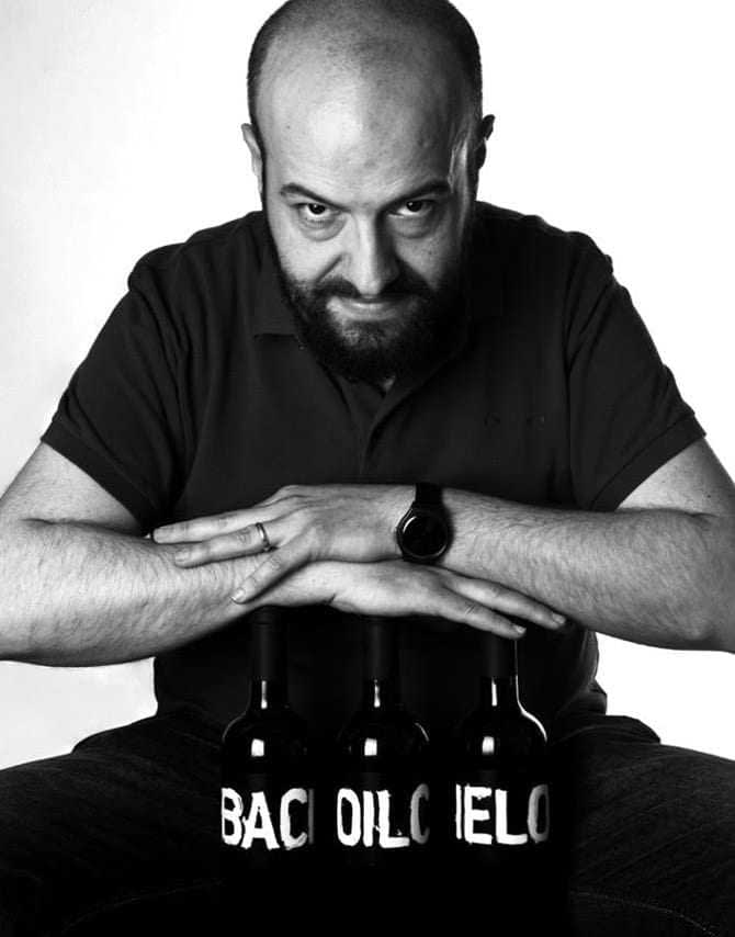
NJU Creative Director, Mario Cavallaro
The exterior of NJU’s design solution consists of “a box with two, well-spaced, uppercase, san-serif weights with unusual cuts across the terminals, varying stroke widths and plenty of unprinted space” for a minimalist effect. A silver block foil finish only strengthens the Premium imagine of the packaging, and its content. On the contrary, the bottle’s design and graphic seems to be more related to the themes of heritage, experience and value of craftsmanship.
According to Baird, it even “draws an analogy between enduring religious history and the ancient practice of olive oil production” due to the stylized image of a woman — representing the Madonna of the Sanctuary near the farm — that seems to be etched in a monochromatic print on the paper of the peculiar leaflet/label. In the inside, it contains information about the farm, hand written details about the selected oil and narrative elements that reinforce the communicative elements of the design. The Madonna seems to be blindfolded by the rubber band that keeps the label closed, also reminding of the good luck-bearing goddess Fortuna.
Mario Cavallaro, creative director of NJU, said: “We are very happy for this recognition to our research in design quality. And we are even more happy as this means that we succeeded in giving Antonino Mennella’s great extra virgin olive oil, which has been awarded worldwide, the right cover for the brand’s promise. But most of all, we are proud that two enterprises (both the studio and the client) established in Southern Italy have been appraised and appreciated in such an important context as San Francisco, beside some high standing international studios and brands.”


