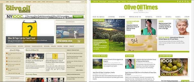
The Olive Oil Times design last month (left) and the new version launched today.
Olive Oil Times unveiled a new design for its flagship website today — the first overhaul to its look since 2010, when the new publication switched on its server with the tagline “olive oil news, reviews and discussion.”
The clean interface is decidedly brighter and less cluttered than the old design that had a textured background and a darker theme. Font sizes are bigger, with a more modern feel overall.
Publisher Curtis Cord said the change had been a long time coming. “The original design and branding served us well, but we needed to make improvements to its usability across all devices and optimize the format for our growing readership.”
The new design, which was developed in-house, is still in “beta” with some sections in ongoing development. Improved Olive Oil Guide, Retailers Directory and Recipes sections will be uncovered in the next few weeks.
“In early 2010, two percent of our visitors were viewing the site with mobile devices — last week it was half. The website needed to be faster and more convenient for mobile readers, and generally easier to navigate on all devices, Cord said. “I think our readers will enjoy the upgrades we’ve made.”
Olive Oil Times was founded four years ago as an independent news source, and remains the industry’s unbiased “publication of record.” Cord said such impartiality is rare in the big-business world of olive oil, and remains the cornerstone of OOT and its other projects, which include the New York International Olive Oil Competition and the recently-launched International Olive Oil School.


